![](https://cdn.myportfolio.com/c4bf54c6-019f-49b4-93ba-1f282e7d00a5/2a4695cd-1388-47cb-b9d2-c864d17d5063_rw_1920.jpg?h=53c88f387761ee972c14e60786b2785e)
![](https://cdn.myportfolio.com/c4bf54c6-019f-49b4-93ba-1f282e7d00a5/103bbd72-4c0a-4a99-ad1b-f48f4241d3cd_rw_1920.jpg?h=5031eb236adcb0411c26bcd911968e61)
TIMELINE + ROLES
2 WEEKS, SOLO PROJECT: PACKAGING, BRANDING
TOOLS
Procreate, Photoshop, Figma
CHALLENGE
In a market flooded by competing products, many consumers choose their wine by label preference alone (a wine.net survey indicated that the number was as high as 80%). With this in mind, how might we create an art driven design system that is eye-catching and scalable?
SOLUTION
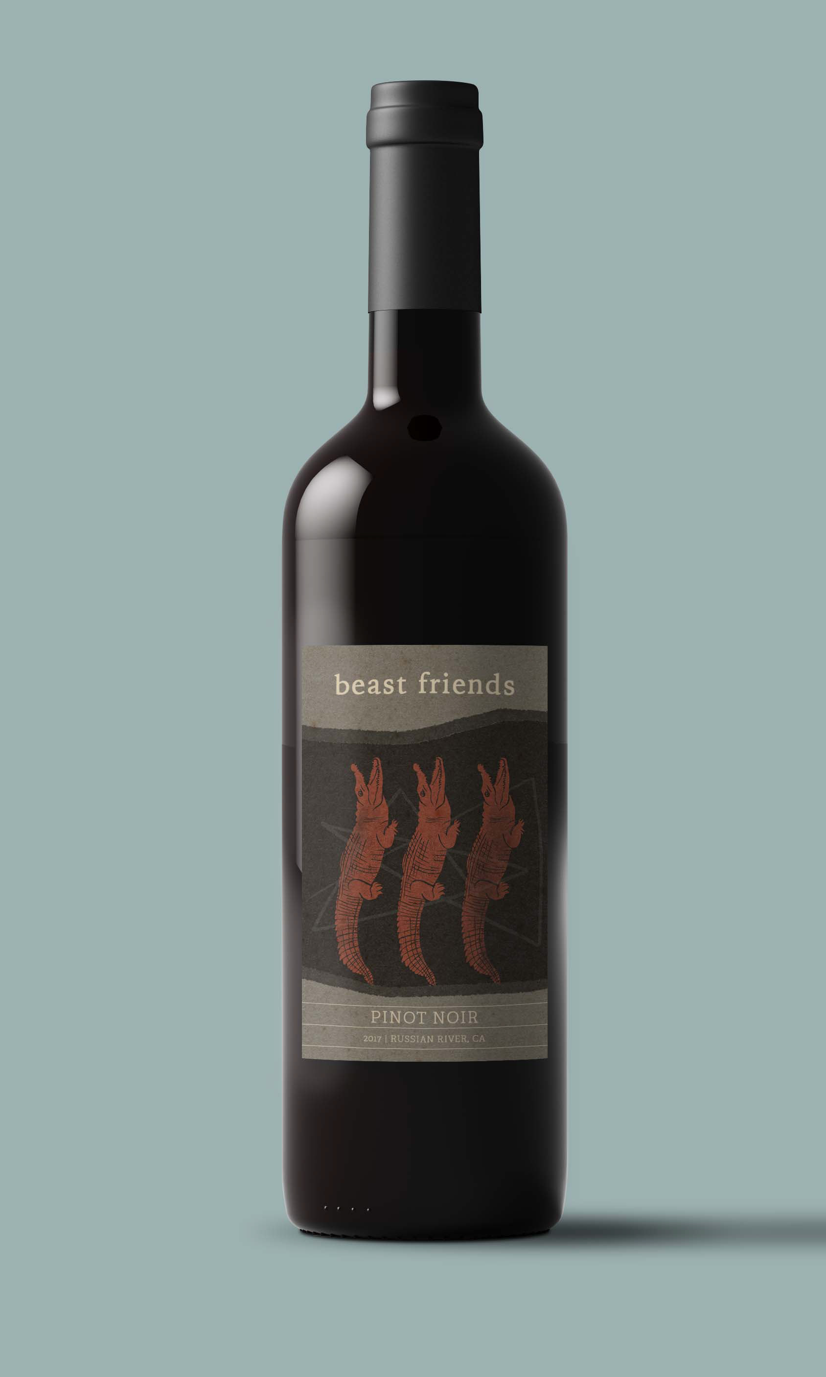
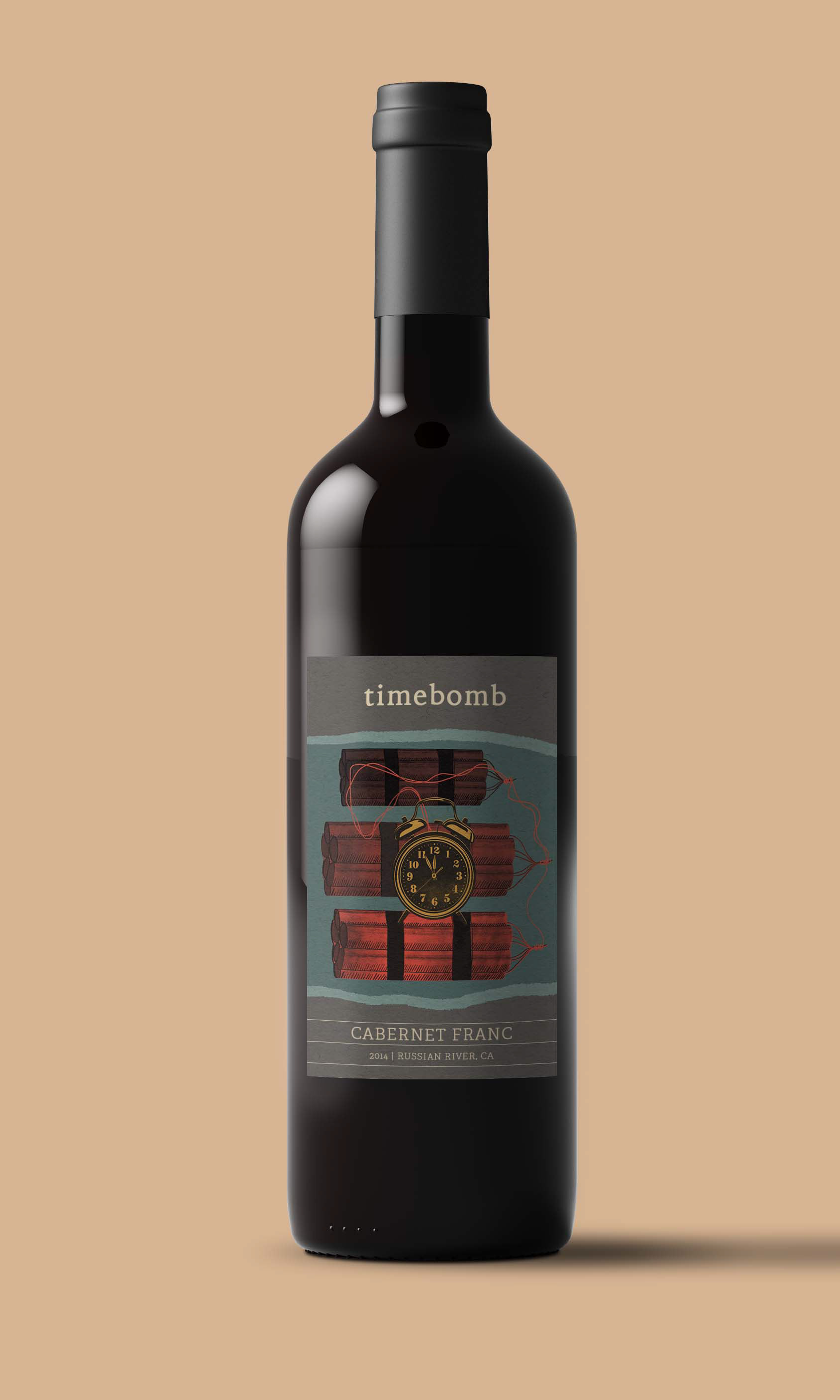
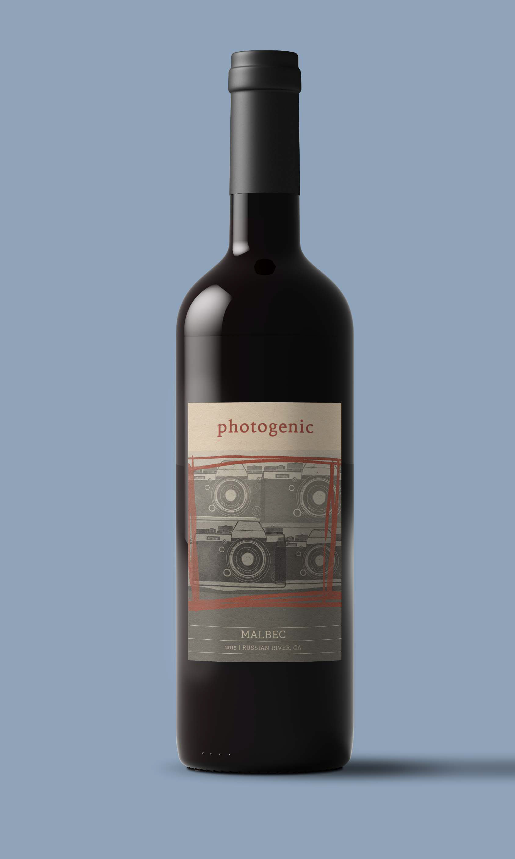
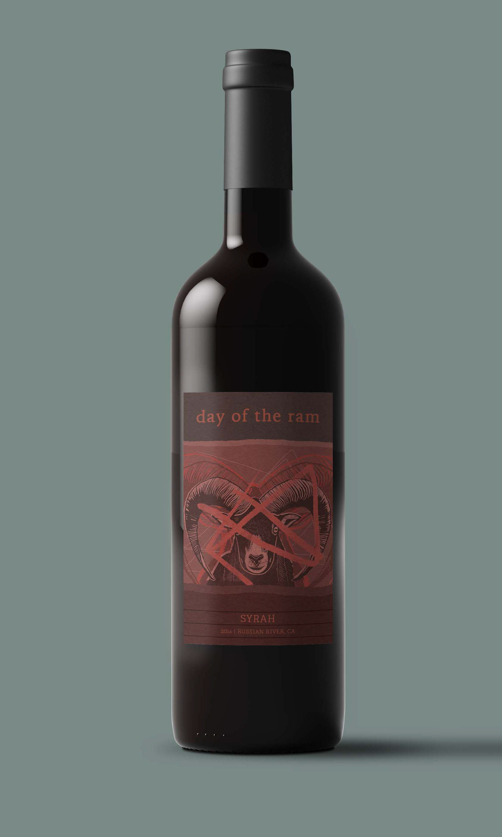
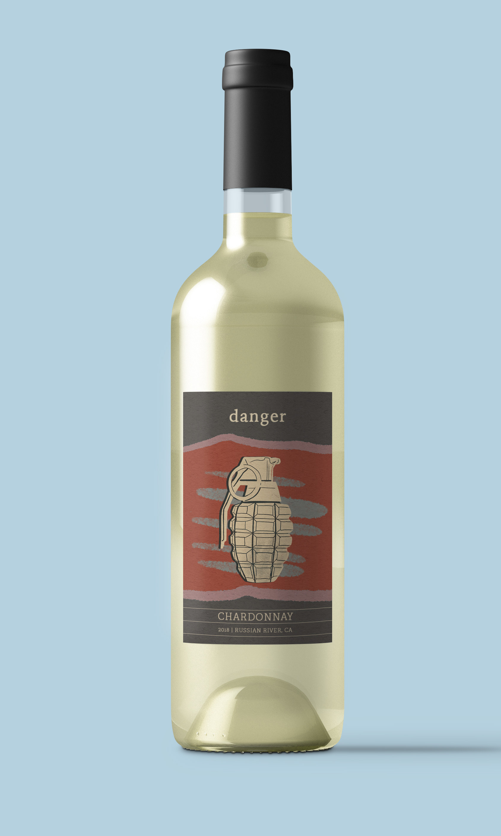
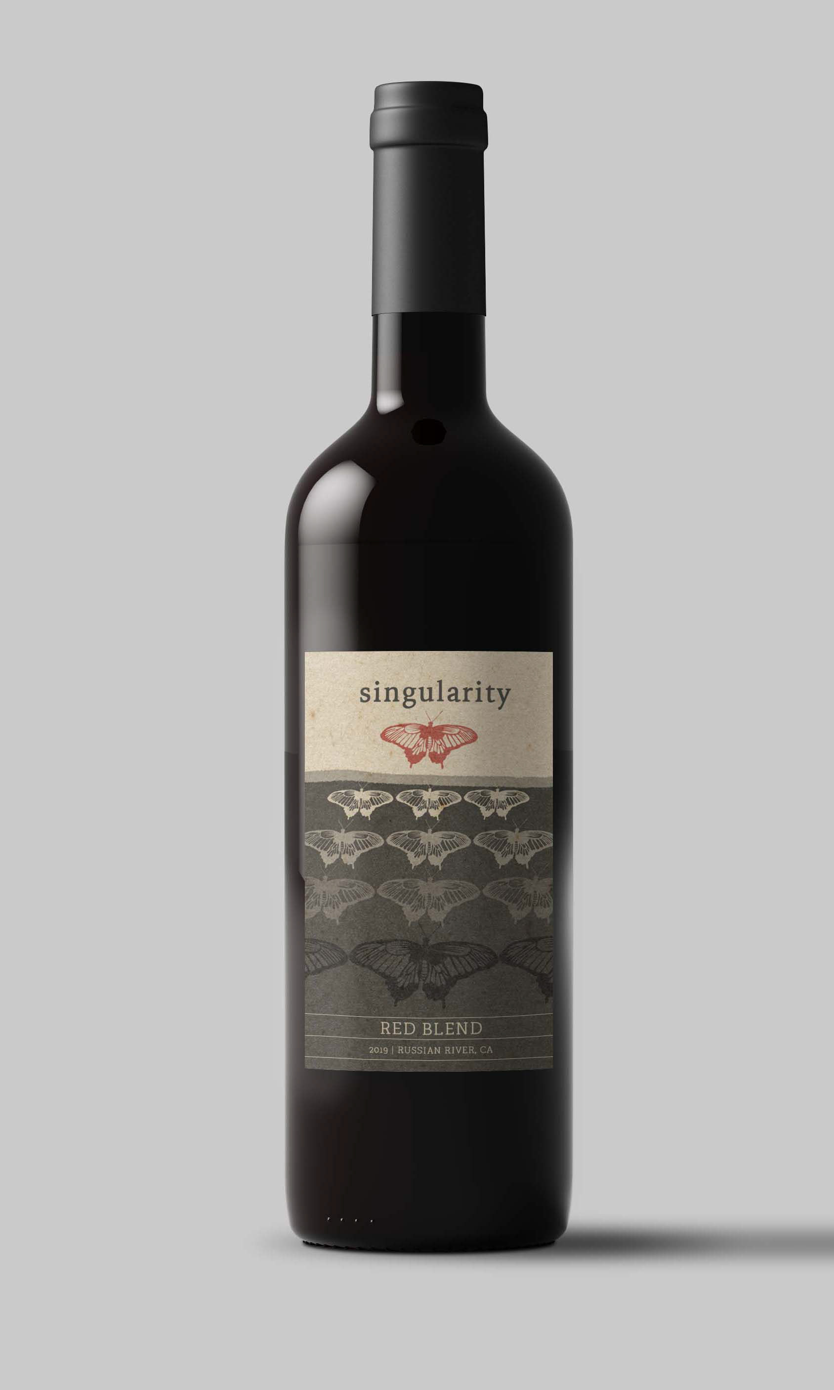
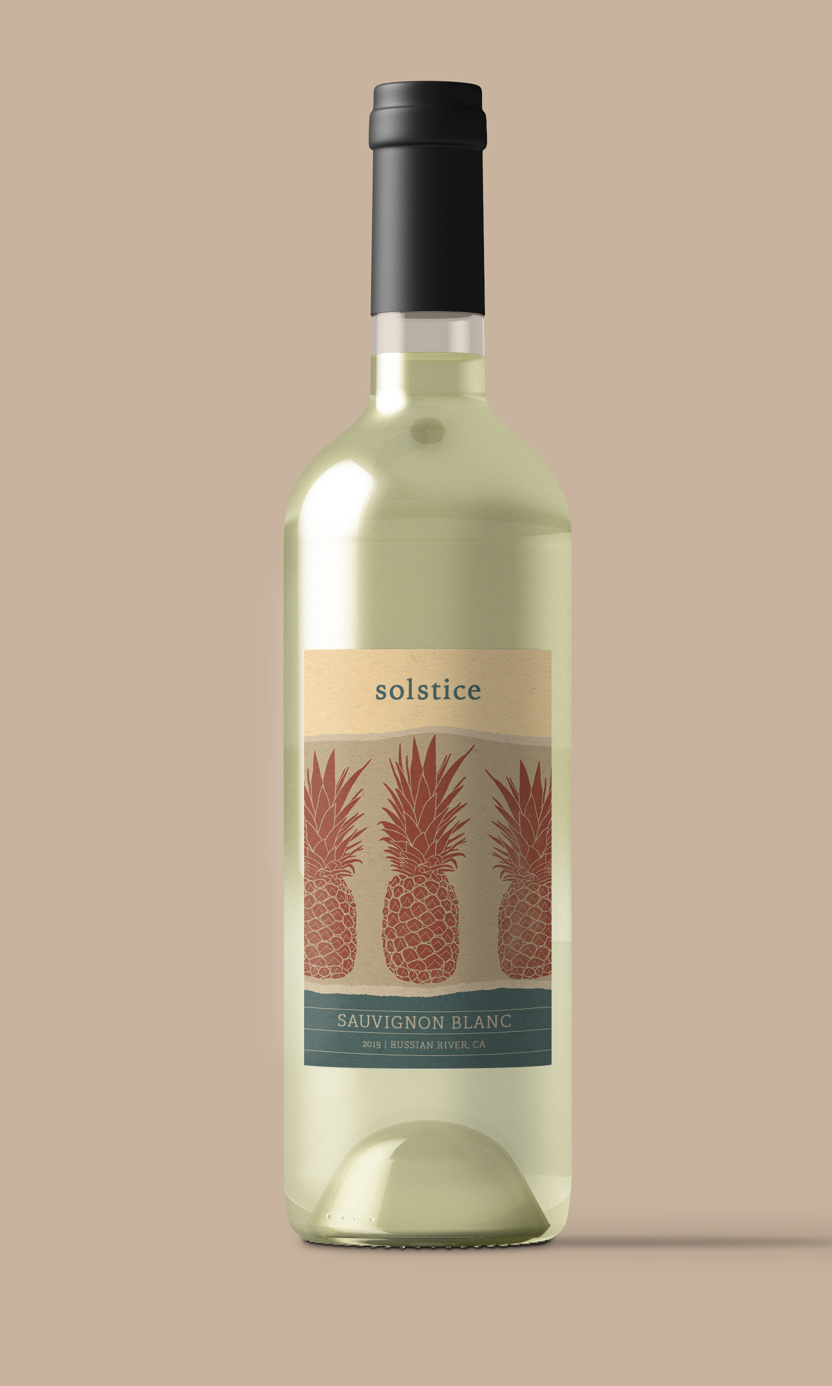
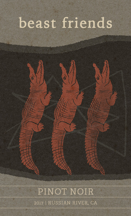
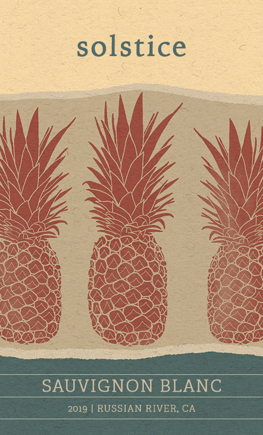
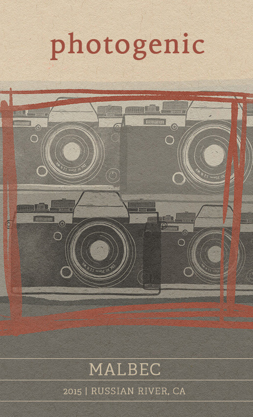
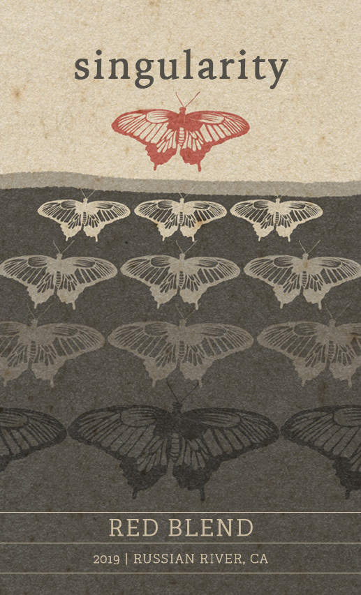
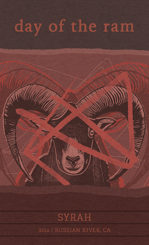
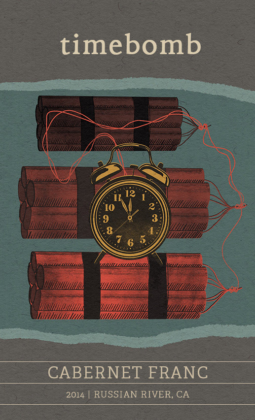
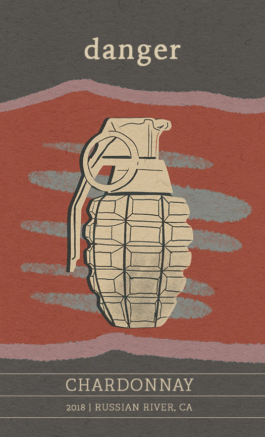
These wine labels combine intriguing names, punchy artwork, and elegant, simple typography to create a cohesive product line that will form a lasting connection with wine shoppers.
![](https://cdn.myportfolio.com/c4bf54c6-019f-49b4-93ba-1f282e7d00a5/81a11d96-b558-4680-af79-908042a29f5a_rw_1920.jpg?h=de93e8a83ac6315a6e6c9e7d3936ca66)
![](https://cdn.myportfolio.com/c4bf54c6-019f-49b4-93ba-1f282e7d00a5/d1541e8d-e481-4f74-8acd-491d047c3916_rw_1920.jpg?h=8f632aba434e9e23c3d5bb980b687bcd)
![](https://cdn.myportfolio.com/c4bf54c6-019f-49b4-93ba-1f282e7d00a5/1fb2a0d4-0e32-4258-a1e7-2c1be663eb51_rw_1920.jpg?h=54f375b8e2becc11d886a95e03a73ab2)
![](https://cdn.myportfolio.com/c4bf54c6-019f-49b4-93ba-1f282e7d00a5/277b62fb-9871-48c6-8bc6-fa315f3d7b6a_rw_1920.jpg?h=60b060a9673dfb3f58ff12a9e2754634)
![](https://cdn.myportfolio.com/c4bf54c6-019f-49b4-93ba-1f282e7d00a5/d57a340b-8bc3-48d6-a0c1-8969c5e6aa28_rw_1920.jpg?h=cc685689e50637130bd864e46f765a47)
concept
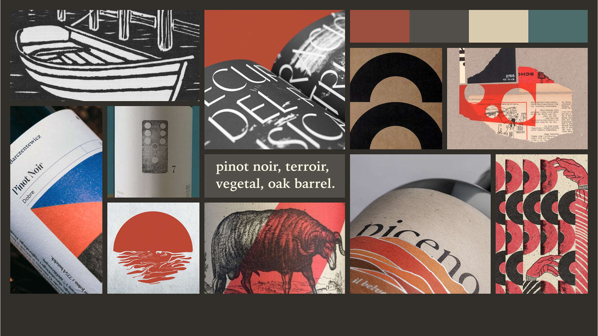
I started this project by collecting inspiration and creating a moodboard in Figma. In particular, I sought out images that highlighted texture, collaged artwork, simple typography, and bold, limited palettes that would could be adapted into brand assets.
![](https://cdn.myportfolio.com/c4bf54c6-019f-49b4-93ba-1f282e7d00a5/cec8d52b-ea1a-4723-abab-d2c903e5f00e_rw_1920.jpg?h=97f014e1c195e45f9d4182f0600d3630)
Approach
I created rough layout sketches to show the relative placement of elements based on competing wine labels. After finalizing a layout, I used Procreate to develop artwork for a range of possible wine products. Following the guidance of my moodboard, I used paper backgrounds from True Grit Texture Supply to provide a weathered substrate for the label designs. Additionally, I created a series of stamp brushes in Procreate to give the artwork a block printed look (I won’t go into detail about the process, but feel free to ask me if you are interested!).
DESIGN SYSTEM
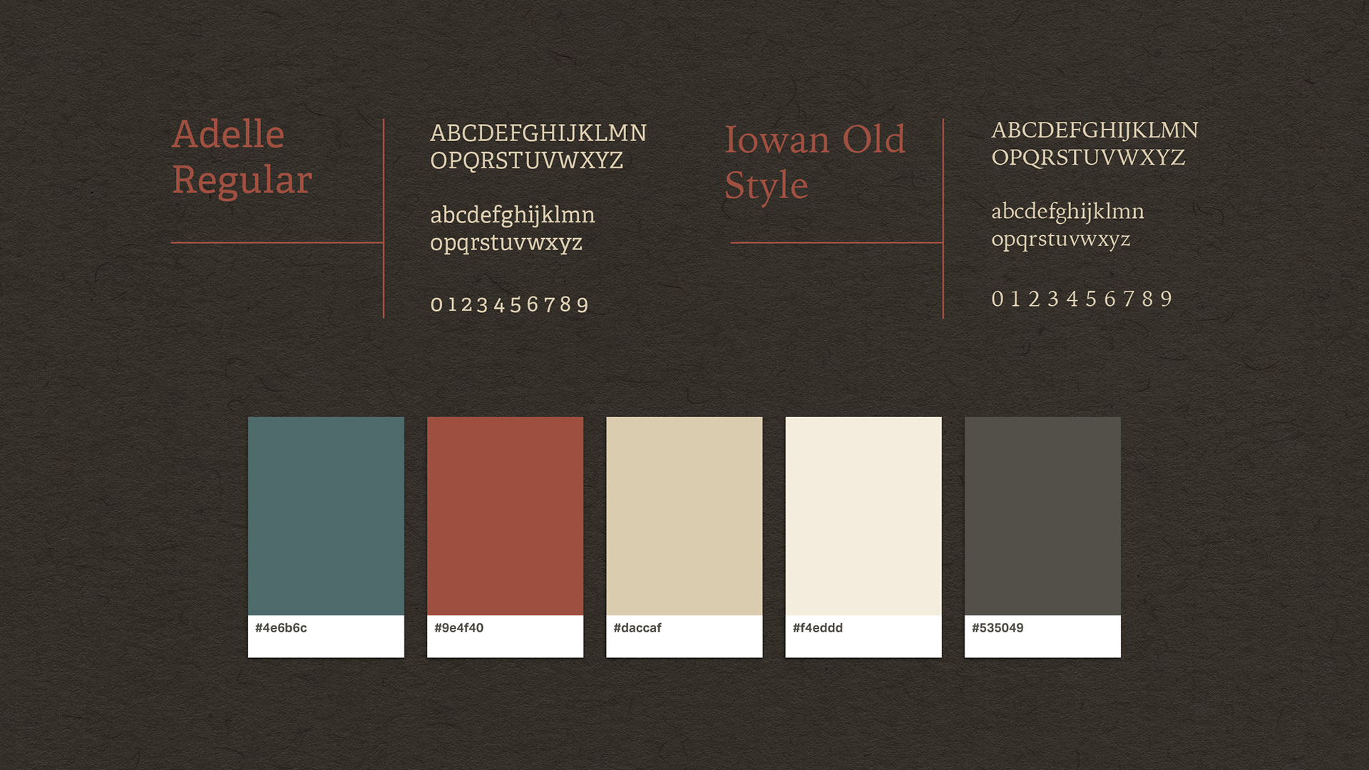
While working on the art, I developed a limited color palette that would be used repeatedly across all label designs to subtly highlight the brand. With the visual style taking shape, I chose simple, timeless typefaces that would express the brand without stealing focus from the artwork.
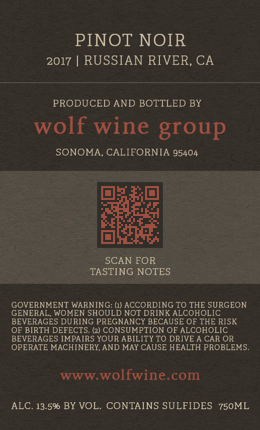
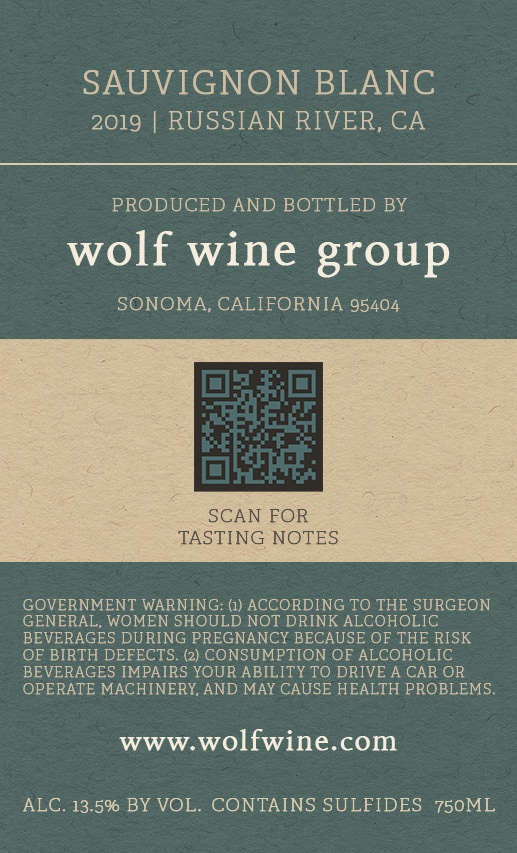
![](https://cdn.myportfolio.com/c4bf54c6-019f-49b4-93ba-1f282e7d00a5/4e1f1efe-9186-4fde-88f5-837b8cf176e4_rw_1920.jpg?h=c84841881ce7de1330fdfb66402ee436)
![](https://cdn.myportfolio.com/c4bf54c6-019f-49b4-93ba-1f282e7d00a5/422f11f7-c42c-4f4b-9828-ea608e6a4bba_rw_1920.jpg?h=d700a6381950c354011ad286838bc3ba)
![](https://cdn.myportfolio.com/c4bf54c6-019f-49b4-93ba-1f282e7d00a5/7800f4b6-a1e7-4f02-90c7-424f4113df83_rw_1920.jpg?h=7915a9c229e766f9d75bc9f4652e0c4d)
LABEL DESIGN
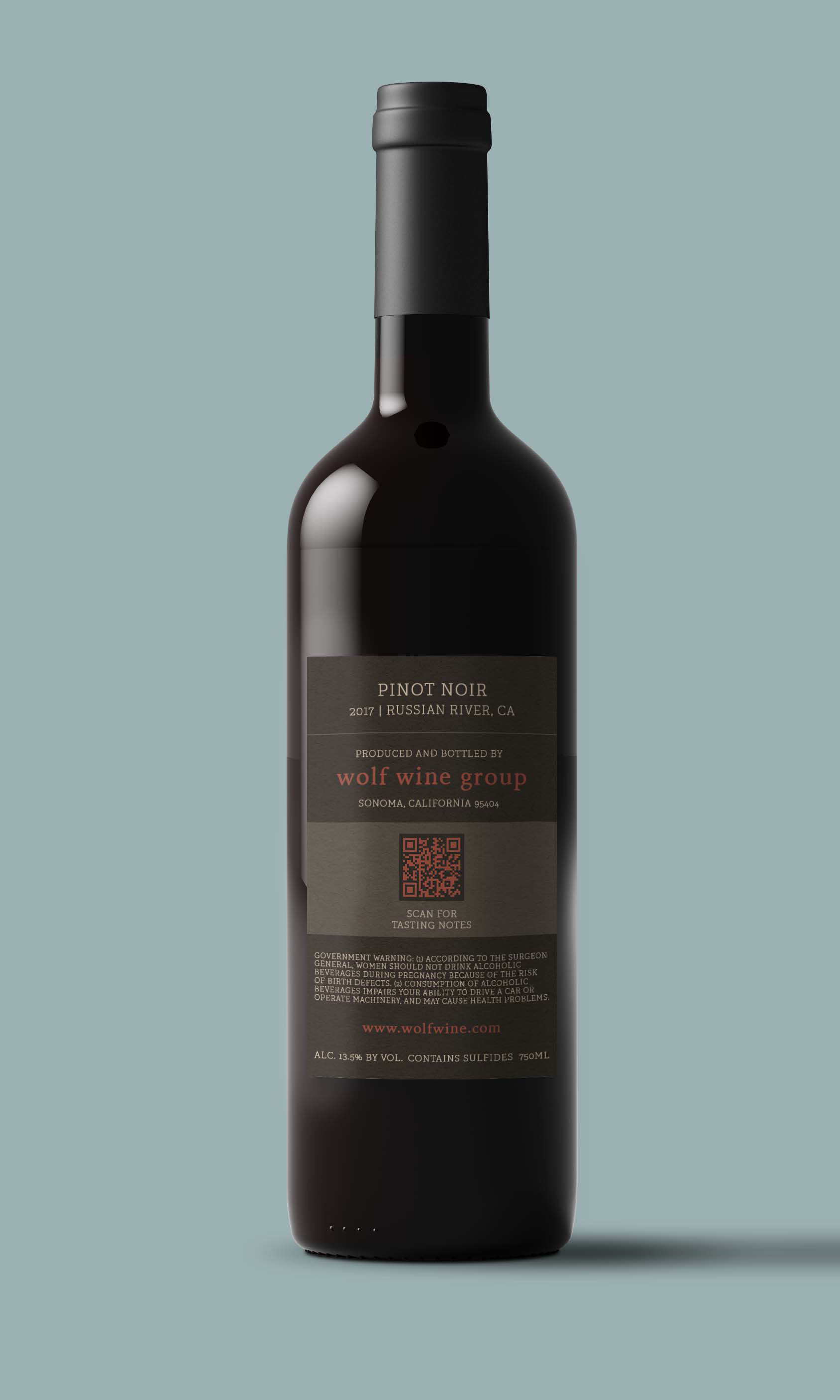
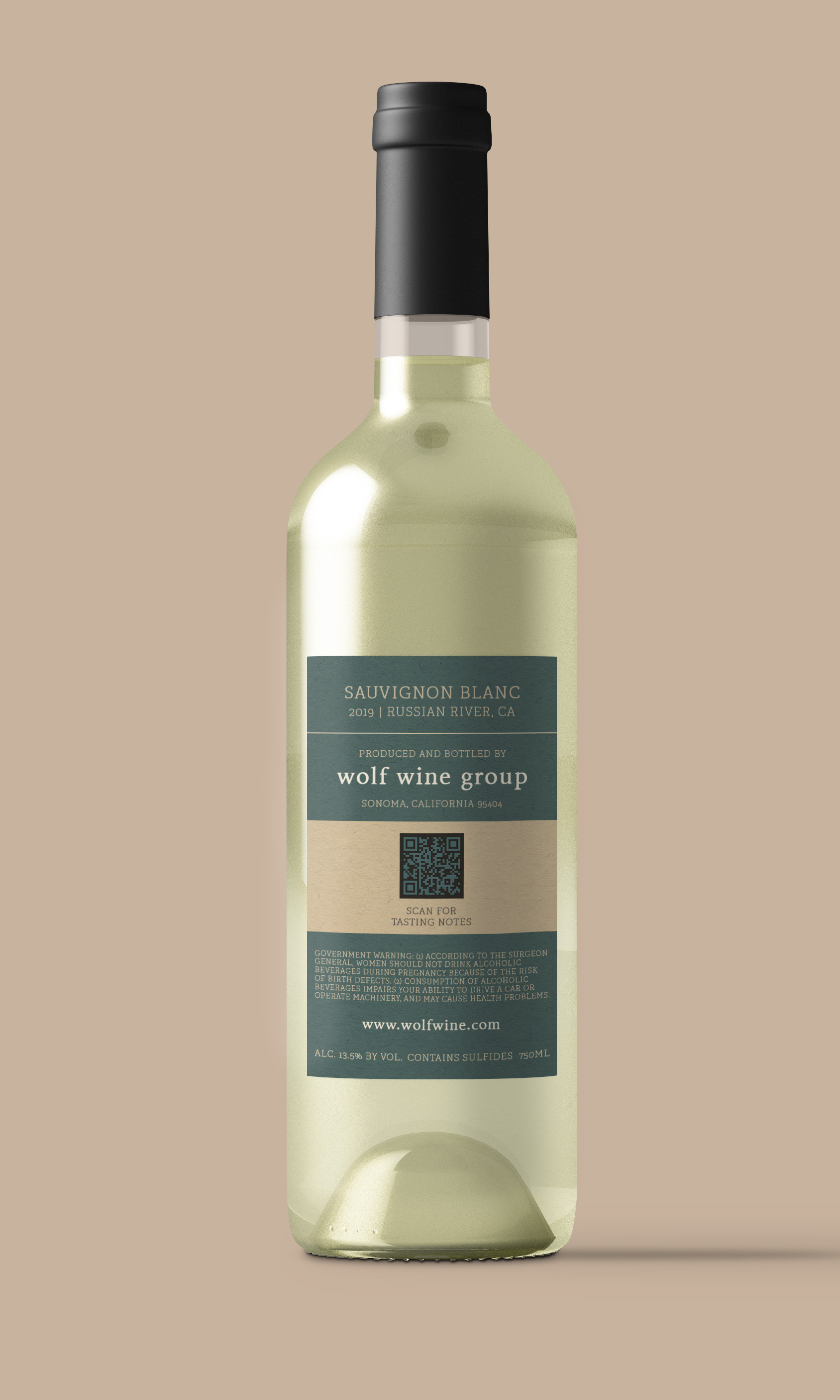
I set up a label template in Photoshop to combine all elements into a single layout. After completing the six front labels, I created reverse labels that would display the legally required information, as well as QR codes that would link to specific tasting notes and reviews for each varietal.
![](https://cdn.myportfolio.com/c4bf54c6-019f-49b4-93ba-1f282e7d00a5/0111ff9a-d823-4277-a412-3f0150f34922_rw_600.jpg?h=df8d35b4cff11738451ab370450ed5ac)
![](https://cdn.myportfolio.com/c4bf54c6-019f-49b4-93ba-1f282e7d00a5/ac366b29-fe90-47b0-9452-61b57496bdd6_rw_600.jpg?h=c1de1db364ff5b73b6b04a4aa4c66abe)
![](https://cdn.myportfolio.com/c4bf54c6-019f-49b4-93ba-1f282e7d00a5/c56586b2-9861-4876-b9f6-e491d0df49ad_rw_600.jpg?h=4025eea0bab85e914a46ba8ee318b5b5)
![](https://cdn.myportfolio.com/c4bf54c6-019f-49b4-93ba-1f282e7d00a5/21b66b2f-1016-40ae-8d45-437f1cc54f02_rw_600.jpg?h=5f8089b54abd3d45cabd11fe02489156)
![](https://cdn.myportfolio.com/c4bf54c6-019f-49b4-93ba-1f282e7d00a5/9c6e4a36-7ce5-4190-b7b2-f6224eee7296_rw_600.jpg?h=b741290d212ba52f2458a3d0b8be1831)
![](https://cdn.myportfolio.com/c4bf54c6-019f-49b4-93ba-1f282e7d00a5/0ba87c32-2b73-4381-b5d7-b7f7f8cbfb50_rw_600.jpg?h=0d1f4f805ff251ca2c487fe425821dd5)
![](https://cdn.myportfolio.com/c4bf54c6-019f-49b4-93ba-1f282e7d00a5/39f7ca1d-c33d-4422-9b4c-3052420d00c7_rw_600.jpg?h=8df7dadadfd6fd8f36d04047217fc2d2)
![](https://cdn.myportfolio.com/c4bf54c6-019f-49b4-93ba-1f282e7d00a5/8d0eada4-29c3-401e-843b-91d750207dbe_rw_600.jpg?h=2dd9f38677c27817371e8e76caf88ee4)
![](https://cdn.myportfolio.com/c4bf54c6-019f-49b4-93ba-1f282e7d00a5/8fb7f9e9-fe61-4dde-82cb-892e1832f1f3_rw_600.jpg?h=e69155c7e4da5b879f546f84e1982768)
CONCLUSION
This project started out as a fun way to adapt my visual art style to a packaging project. As it progressed, I realized how a limited project—based on a design system—could easily be scaled up into a website, or even a full branding package. As always, I really enjoy the chance to exercise my creativity with clear constraints.