TIMELINE + ROLES
4 WEEKS, TEAMMATES: ADAM ROTMIL AND ANDIE KIM - UX, UI
TOOLS
Figma
CHALLENGE
Wild Brains is an early stage startup with a product line of wearable devices—similar to the Apple Watch or the Oura Ring. As part of their attempt to secure funding, the company would like to design an app to accompany its products. Without a complete understanding of the wearable technology (which is still in development) how might we design a realistic and useful app interface?
SOLUTION
By conducting competitive analysis and generative research, our team was able to create a series of personas and storyboard scenarios that produced app features driven by user needs.
Background
Wild Brains is building a wearable device that fits behind the ear, measuring brain activity and providing the user with real-time feedback. The company will be developing a companion app that provides a dashboard for the experience, helping users to understand their health metrics and receive behavioral guidance based on their unique brain activity. Our team was tasked with understanding how users interact with similar products and what they might desire from a Wild Brains app.
GENERATIVE RESEARCH
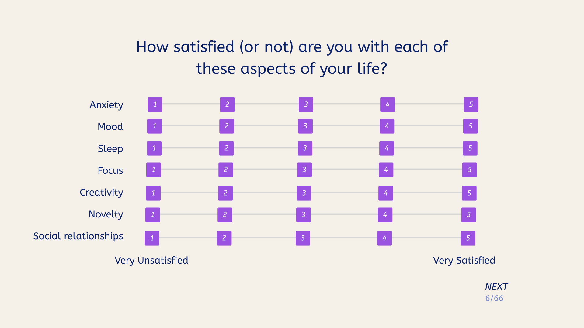
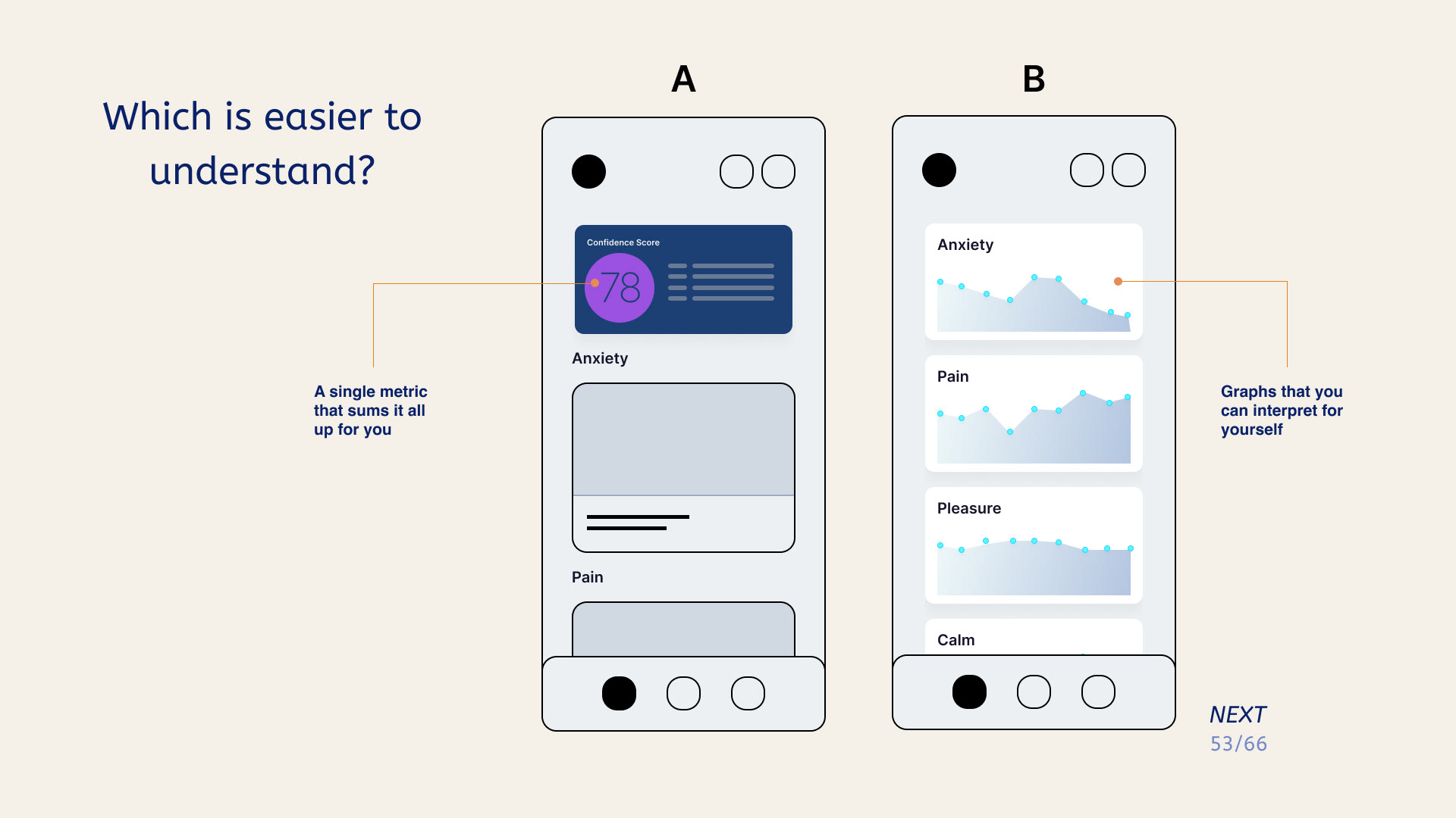
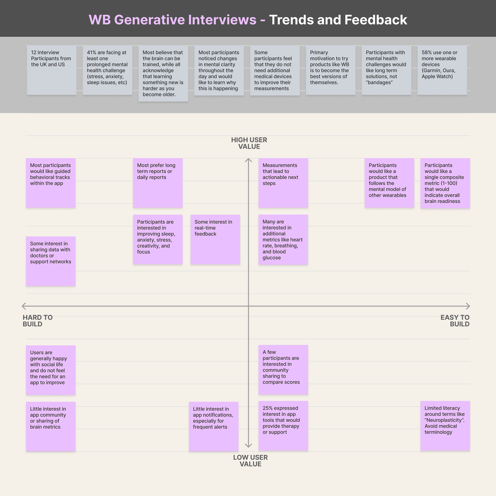
We started out by interviewing 12 participants to establish a baseline understanding about mental health goals, brain science literacy, and generic app preferences. We also used specific A/B testing that helped us to make informed decisions when designing the interface. Overall, we found that most users were receptive to wearable devices but preferred a guided behavioral approach based around a single metric that required limited knowledge about brain activity.
PERSONAS
Using aggregate data from the interviews, we developed several personas and accompanying storyboards that represent likely users of Wild Brains. Our primary persona, Brian, is a high achiever with a need for control and a high degree of motivation.
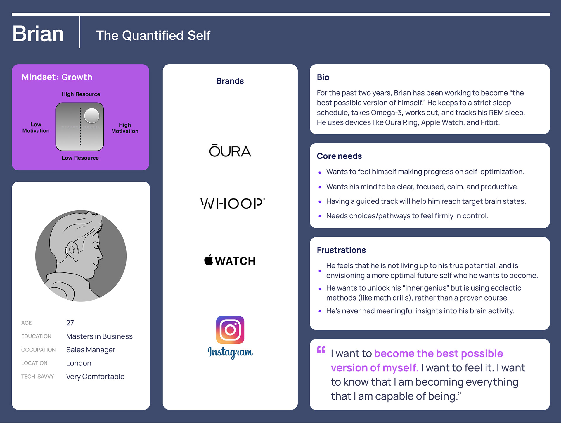
Persona 1- Brian: The Quantified Self
STORYBOARDS
Brian's journey is traced in a storyboard as he discovers the app, takes his first measurement, and begins a behavioral guidance track called "Clarity and Focus".
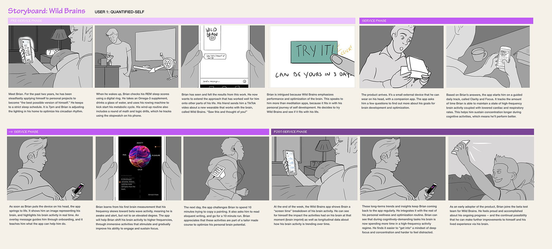
Storyboard for Persona 1 - Brian: The Quantified Self
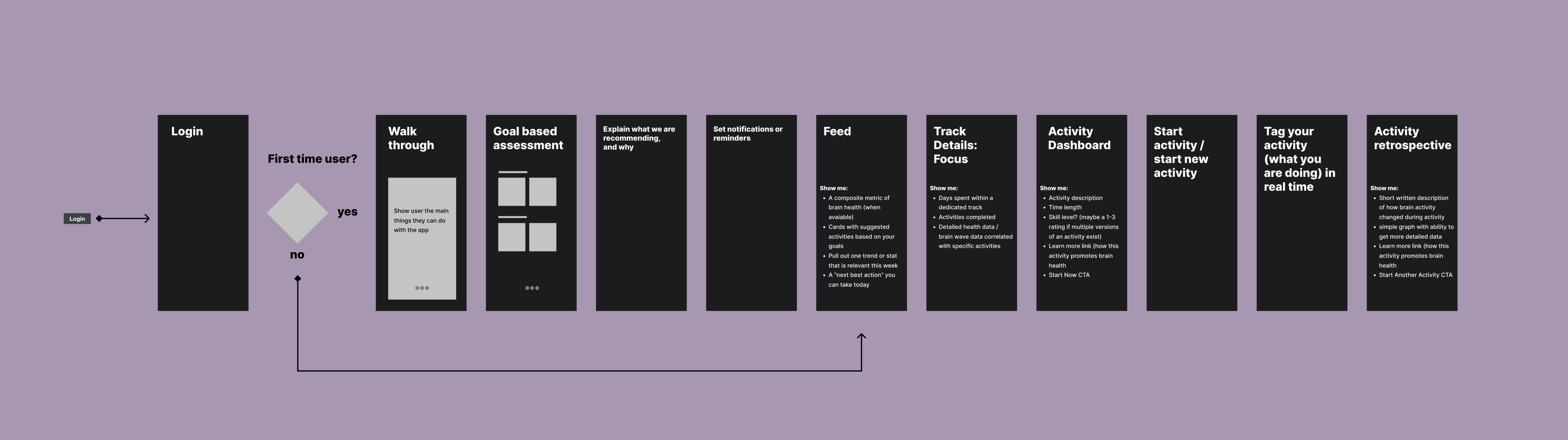
Low Fidelity Concepting
We envisioned a series of screens that would align with each frame of the storyboard, relying on common user patterns and heuristics to guide our decisions. At this stage we mapped out the basic information architecture and flow of the app.
Early concept for app screen content
Low fidelity screens for activity user flow
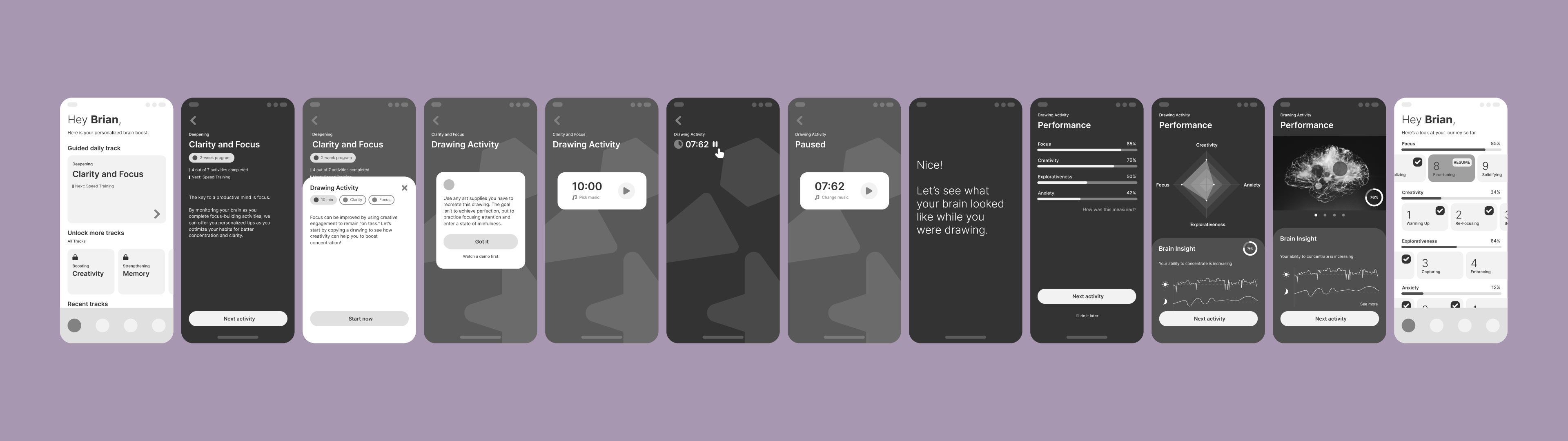
UI DESIGN
Finally, we used a UI kit to speed up the high fidelity design. By adopting a ready-made design system with type, color, and button styles defined, we were able to quickly adapt our low fidelity screens into a realistic solution for the client to present to investors.
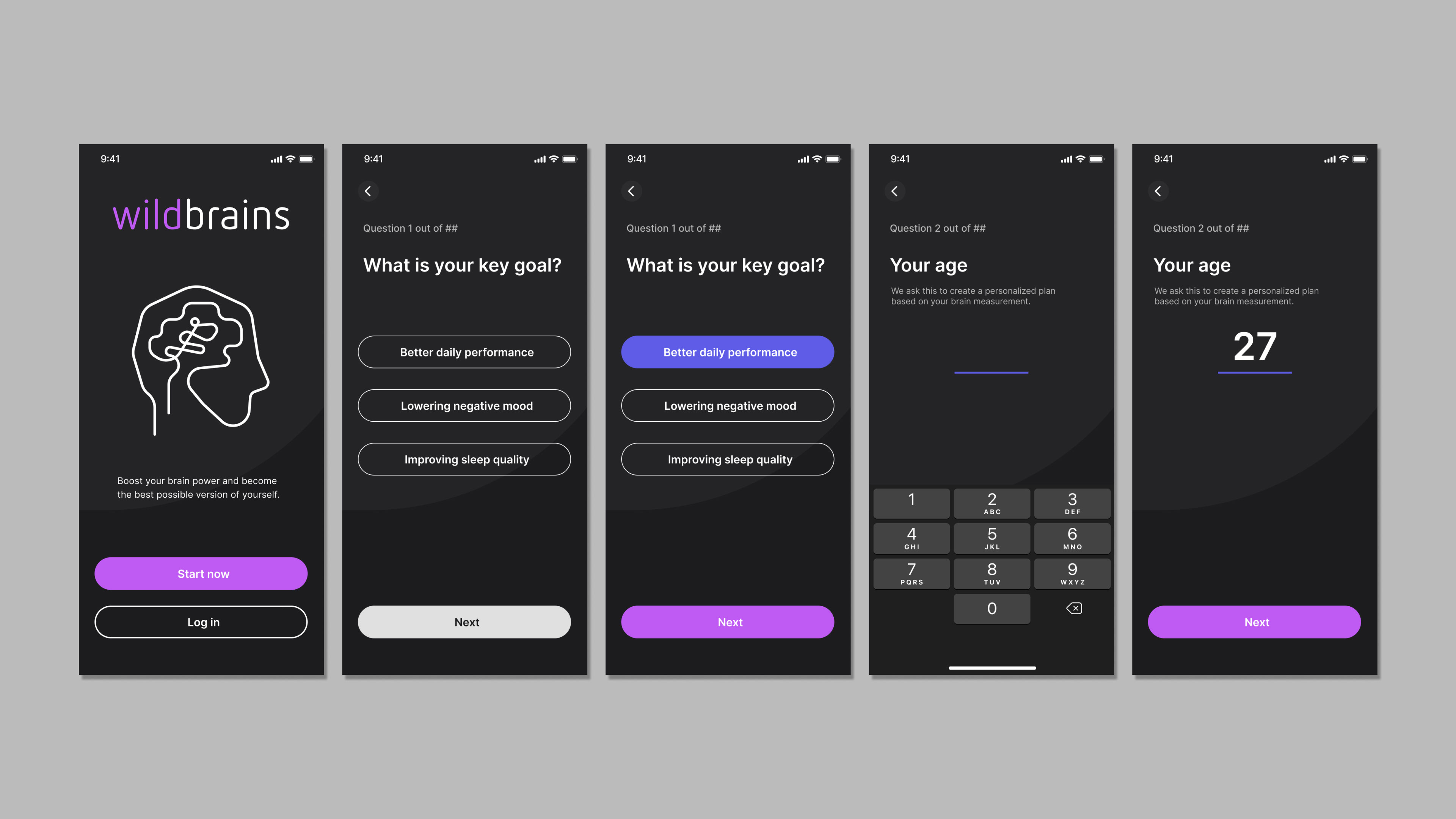
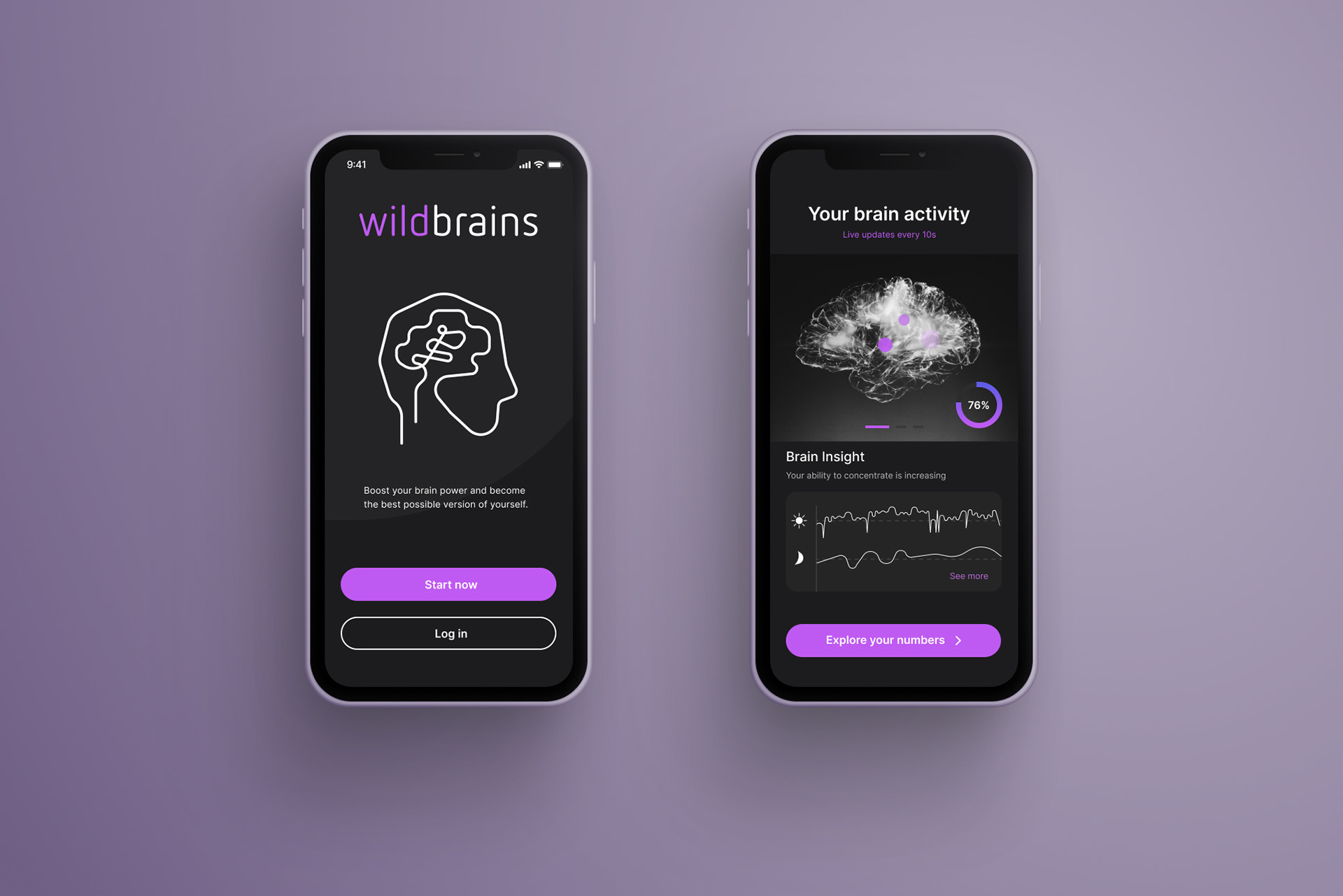
Onboarding screens (partial user flow)
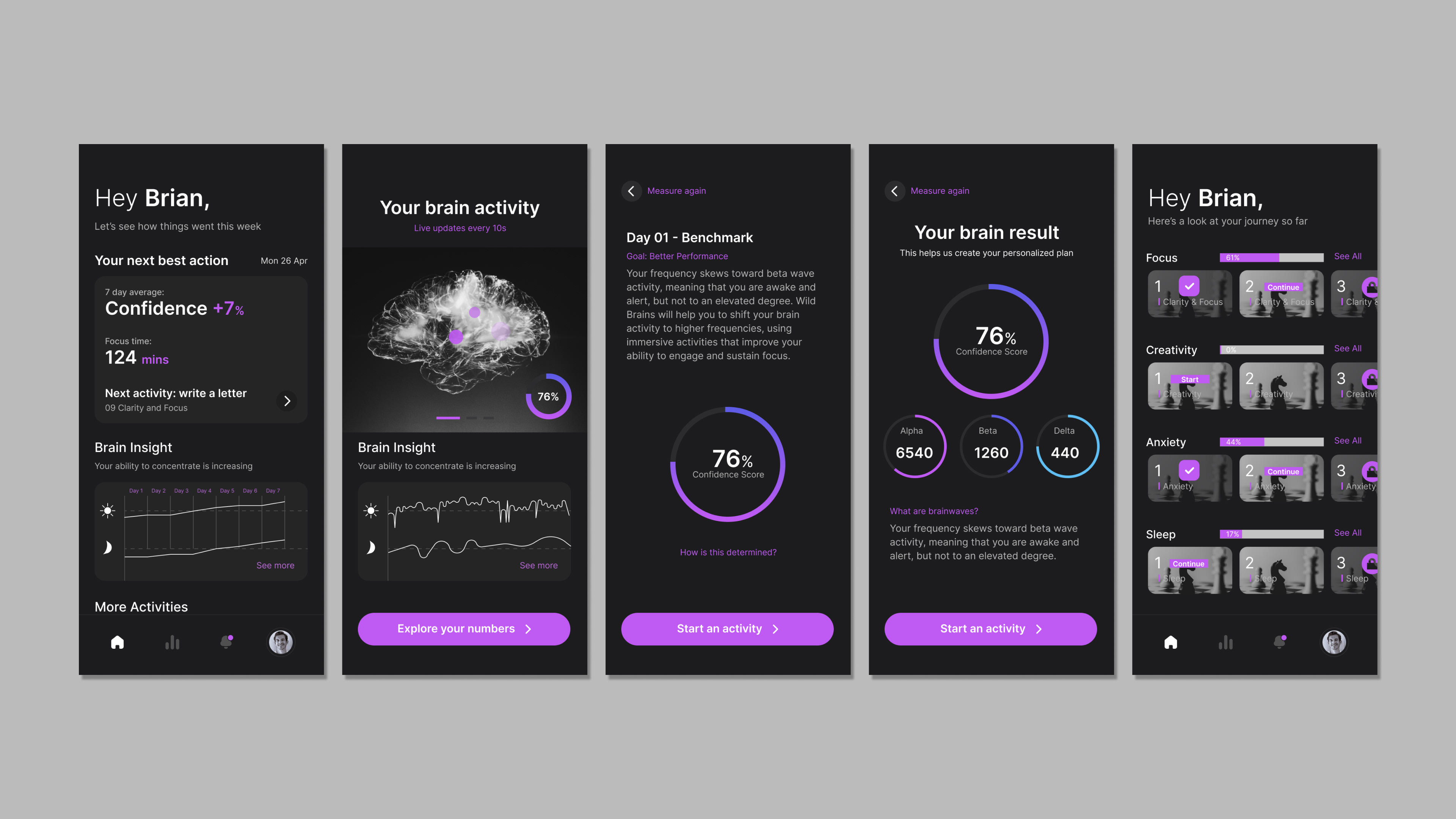
Home screens (partial user flow)

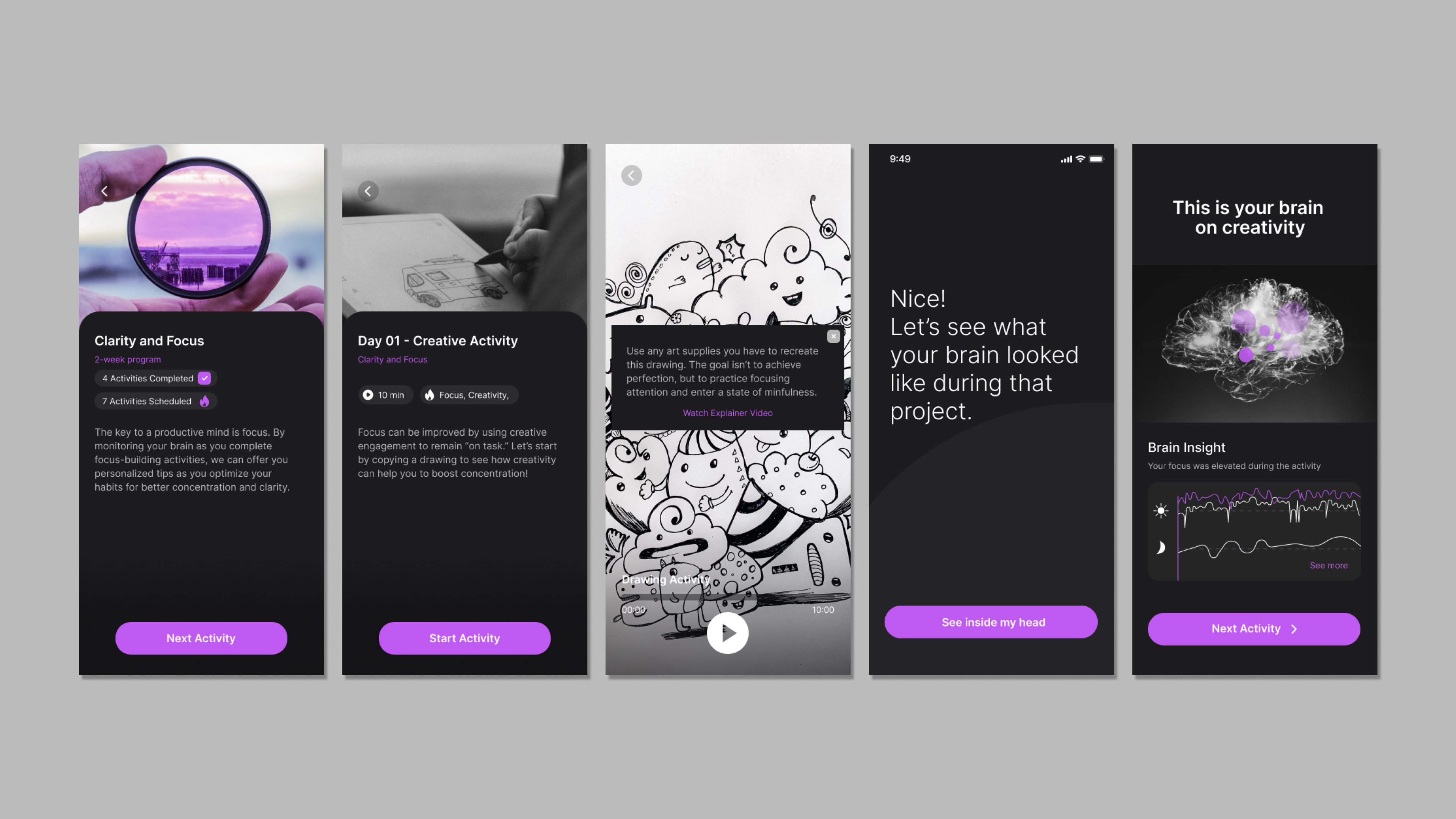
Activity screens (partial user flow)
CONCLUSION
Through research and ideation, our team was able to produce an app prototype with features driven by the needs and preferences of likely users. This foundation will continue to guide the company as it refines its technology and eventually builds an interface.